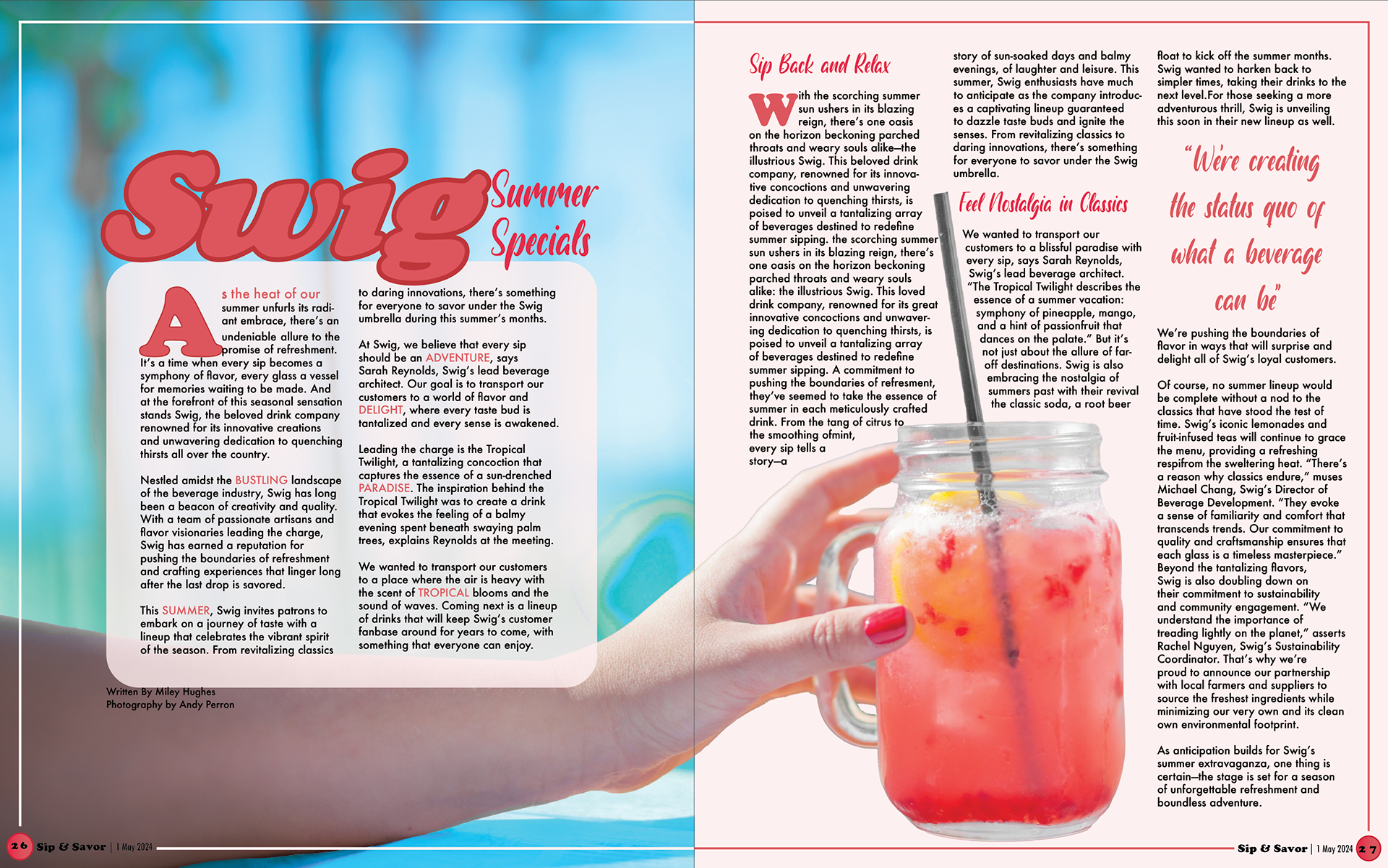
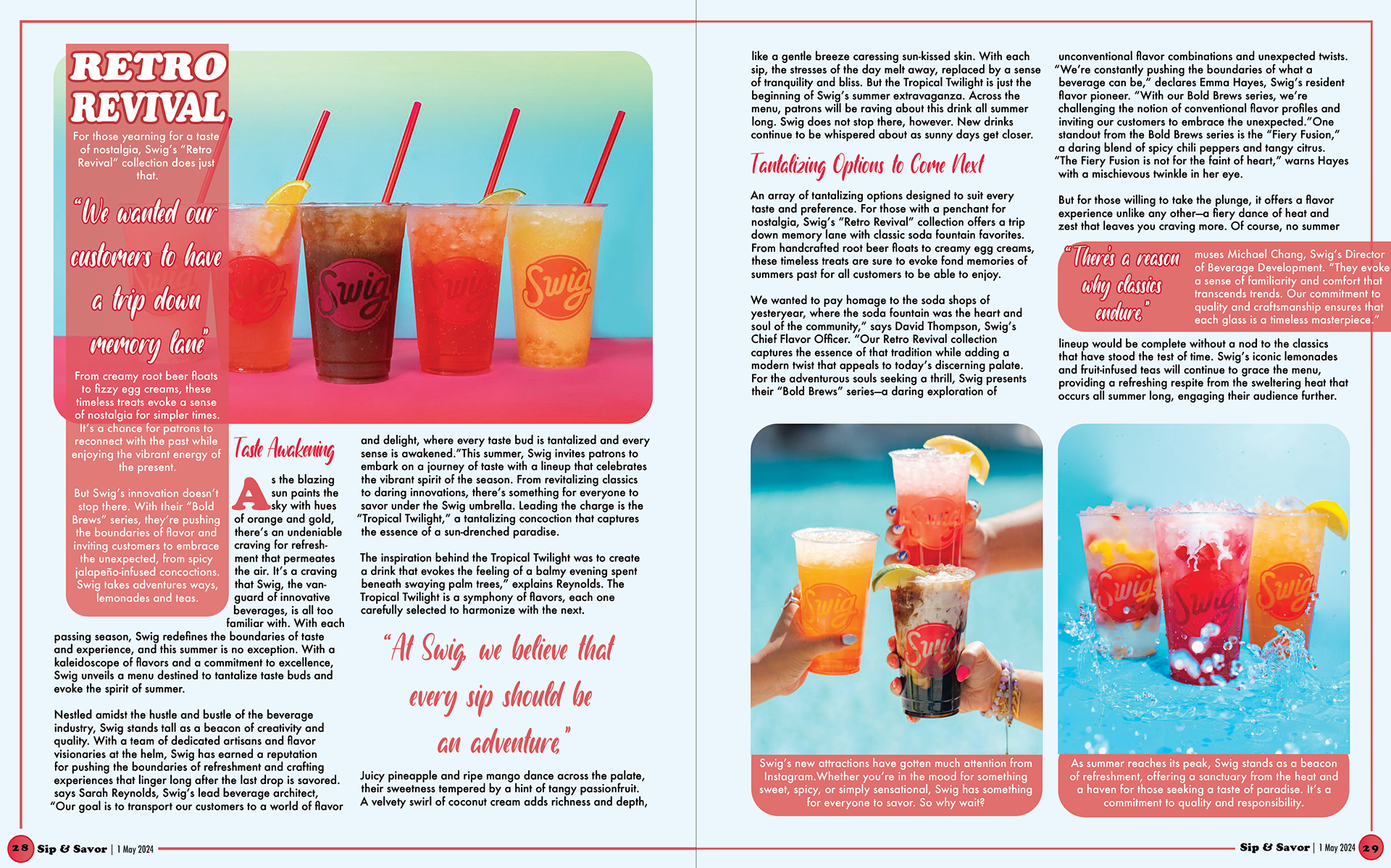
These are two magazine spreads I designed for the soda shop Swig, featuring a playful and summery color scheme. Each page was thoughtfully crafted to balance text and images, ensuring the layouts felt dynamic yet uncluttered. I mainly focused on visual interest for this project: using 3D effects and vibrant colors in each image. I used grid styles to create a structured design, carefully spacing each paragraph in relevance to the other images on the page. To enhance the hierarchy, I emphasized key text with larger sizes and playful fonts, making it engaging and eye-catching. This project taught me how to effectively combine balance and hierarchy while using Adobe software to create polished and organized layouts.